Gringa Taco Bars latest menu expansion is delicious, nutritious and had a little helping hand from the team here at Wanderer the Studio.
Gringa’s Grab & Go
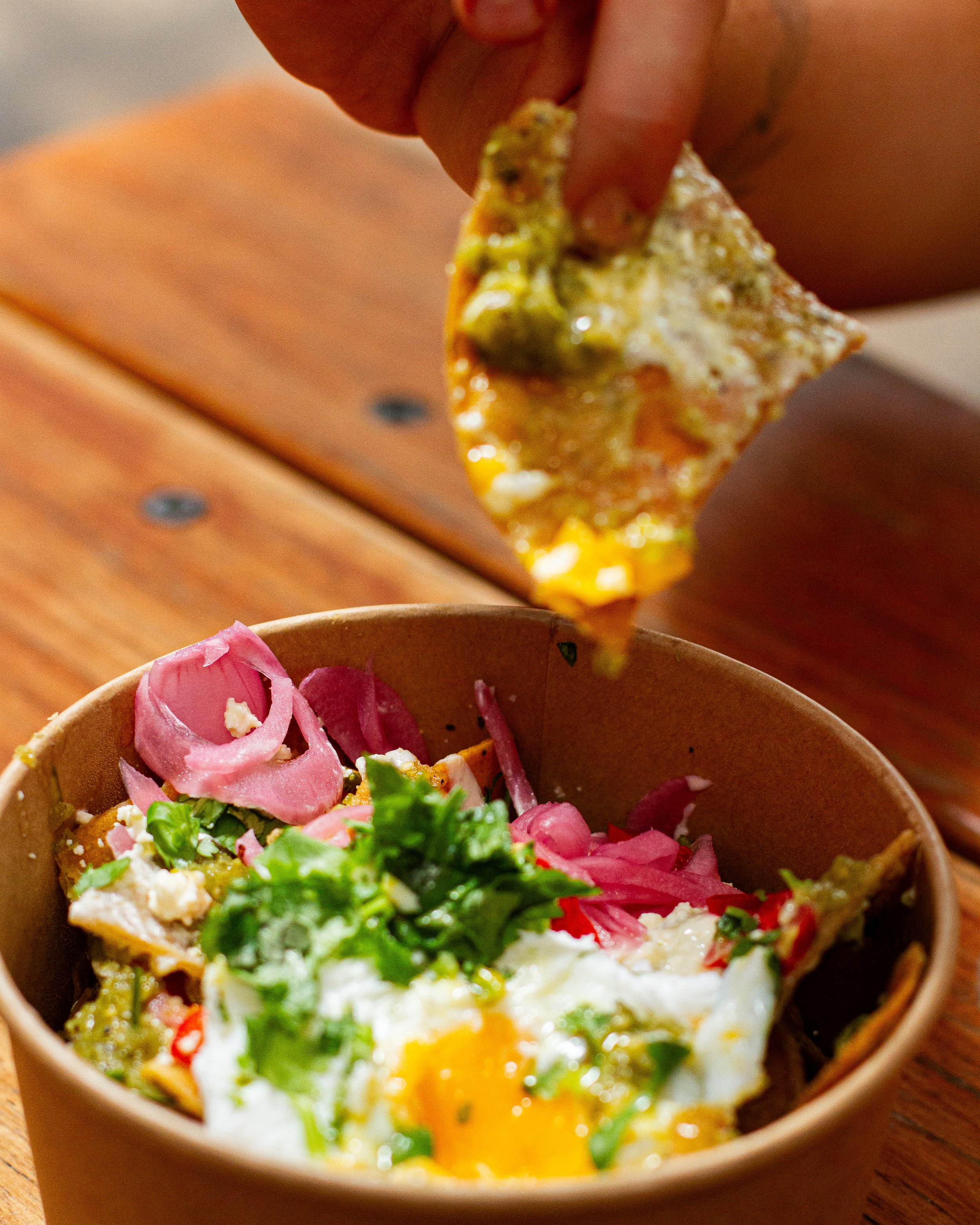
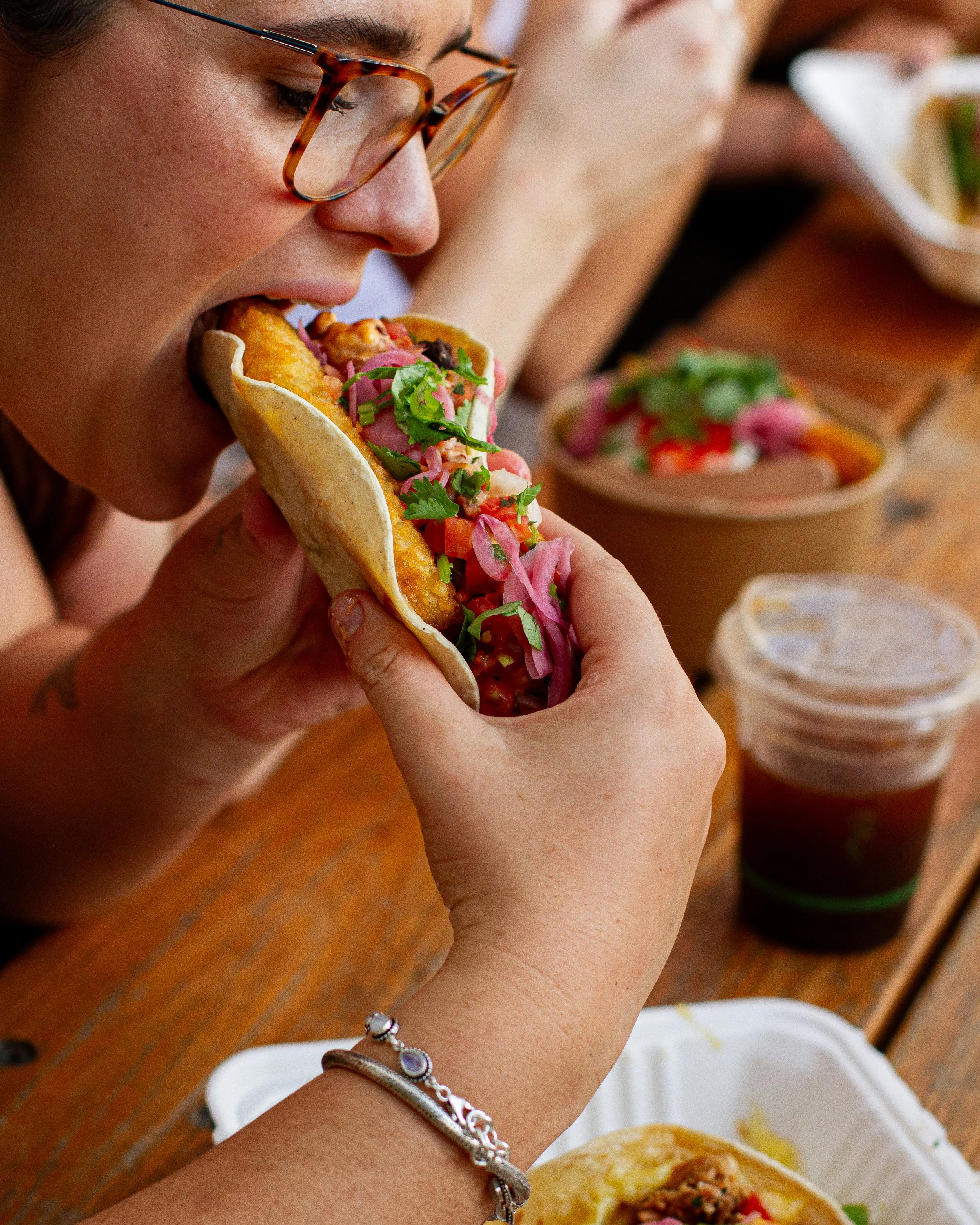
From an idea in Gringa founder Britt’s head, to a bustling breakfast spot, Wanderer the Studio was there: a driving force throughout the whole journey. Triple G’s has a unique offering: where else in town can you get traditional Mexican coffees, Aztec Mochas and Horchata? Or a serve of Chilaquiles, or Mexican Huevos con Chorizo or beans with jalapeño waffles—not to mention traditional Mexican deserts.
Here’s where The Studio was placed in a bit of a predicament: the coffee culture in Australia runs deep. They say there’s coffee running through our brains. So how do we convince the locals to trade their flat white for a Dirty Horchata? We carefully utilised integrated marketing communications to tell the world why they should do just that. We also know that humans are creatures of habit. Triple G’s involved a new set of opening hours they’ve not seen before.


With a new campaign, comes a new logo. We don’t do things in halves around here.
We needed a way to differentiate Triple G’s from Gringa’s normal menu, yet maintain the brand’s familiarity and personality. Keeping with the original colour scheme, the Primary circle logo puts a casual spin on our original Gringa logo design—this one modelled after the braid and backwards cap, which founder Britt often adorns.
The secondary logo keeps it simple with a spell-out of the campaign’s name, Triple G’s.
You’ll see one or both of these logos whenever there’s delicious Mexican breakfast involved.
Logo Design

Social Media Presence


The brief was to use Reels, stills and stories to engineer the softest of launches, deliberately leaking information just a little at a time to Gringa’s Meta audience, with the aim of building intrigue, excitement and engagement.
By the time of the grand reveal of Triple G’s and its menu, we had a tuned-in audience who was ready to make their way down for the opening.
In our digital communications, we needed to be super clear and thorough in our messaging—as many people might’ve never eaten or even heard of certain menu items. Not to mention the habits of Australia’s average coffee consumer, and the comfortable familiarity of the classic flat white or cappuccino.
Print Designs

A few new bits and bobs were required around the venue to communicate the new menu offerings.
For an example, take our A-Frame design, which now stands proudly out the front of the venue to communicate the new opening hours. Plus, a menu update to include the new food and drinks. We’ve been in charge of Gringa menus for years now, but this one was super exciting!
Everybody loves a loyalty card, so we knew what we had to do. Additionally, extra signage was required to communicate which tables could be used for dining, and when they need to be vacated.


Content Day!
Getting the Gringa team on board for a photo shoot and to try the new menu items was probably the easiest part of the job.